I chose to redesign an album by the band Circle It. I absolutely adore this band. They are such a fun group of guys that have high energy shows, but quite emotional lyrics. I tried to focus on that with my photography and my layouts.
- First Round of Photography -
I tried to play with the idea of using something to reflect the image of my subject. After the photography, I was planning on doing some photoshop to change the emotion of the reflected subject. This round didn't turn out how I was imagining so I went back to the drawing board.
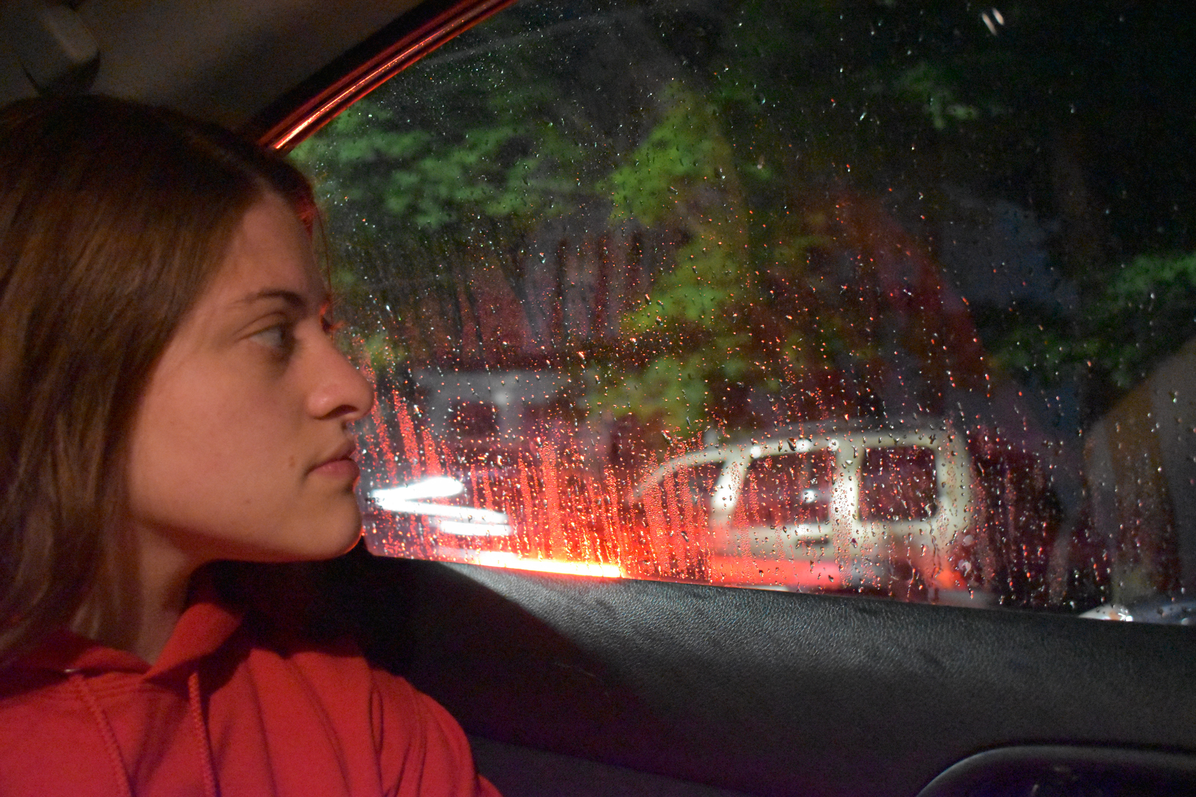
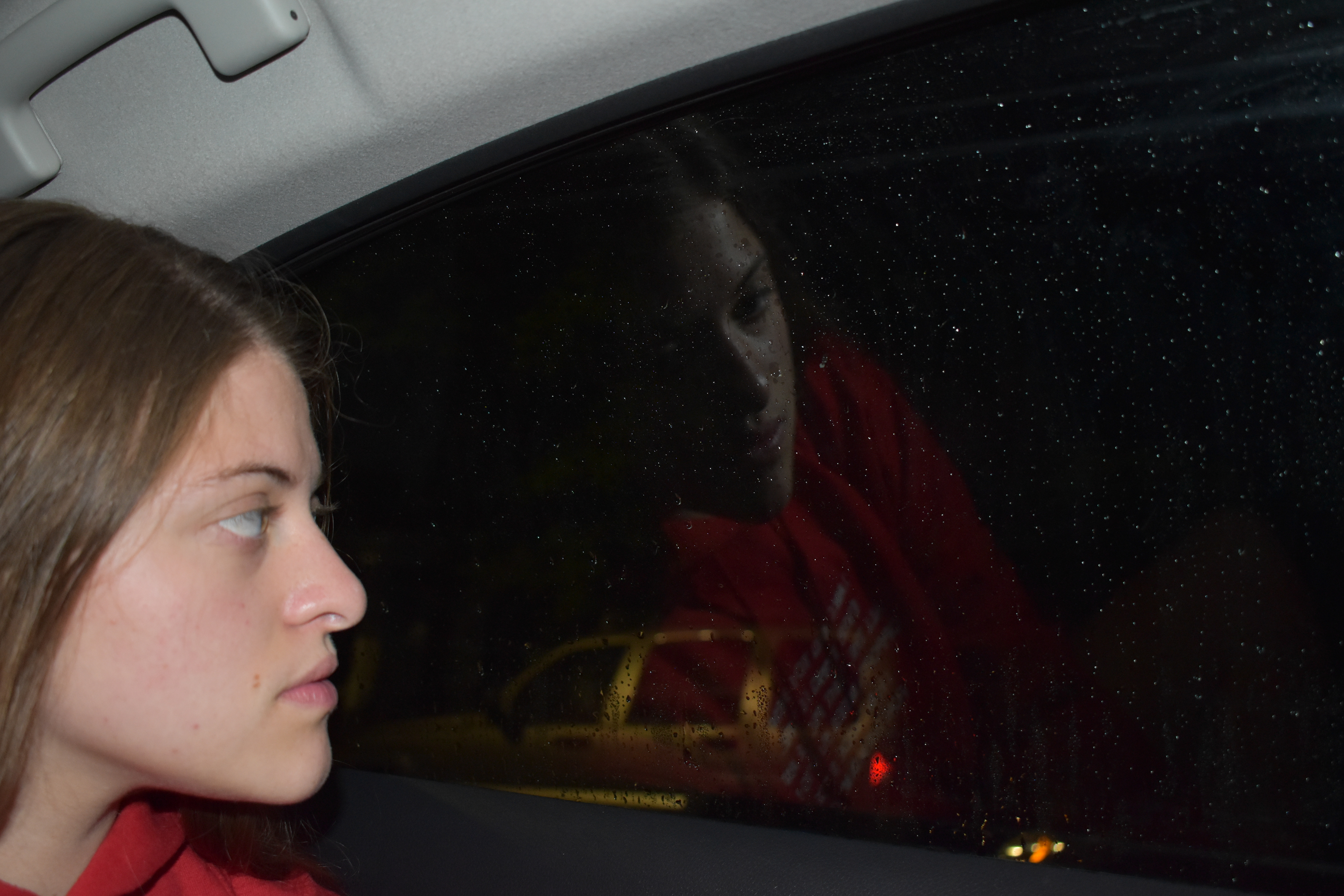
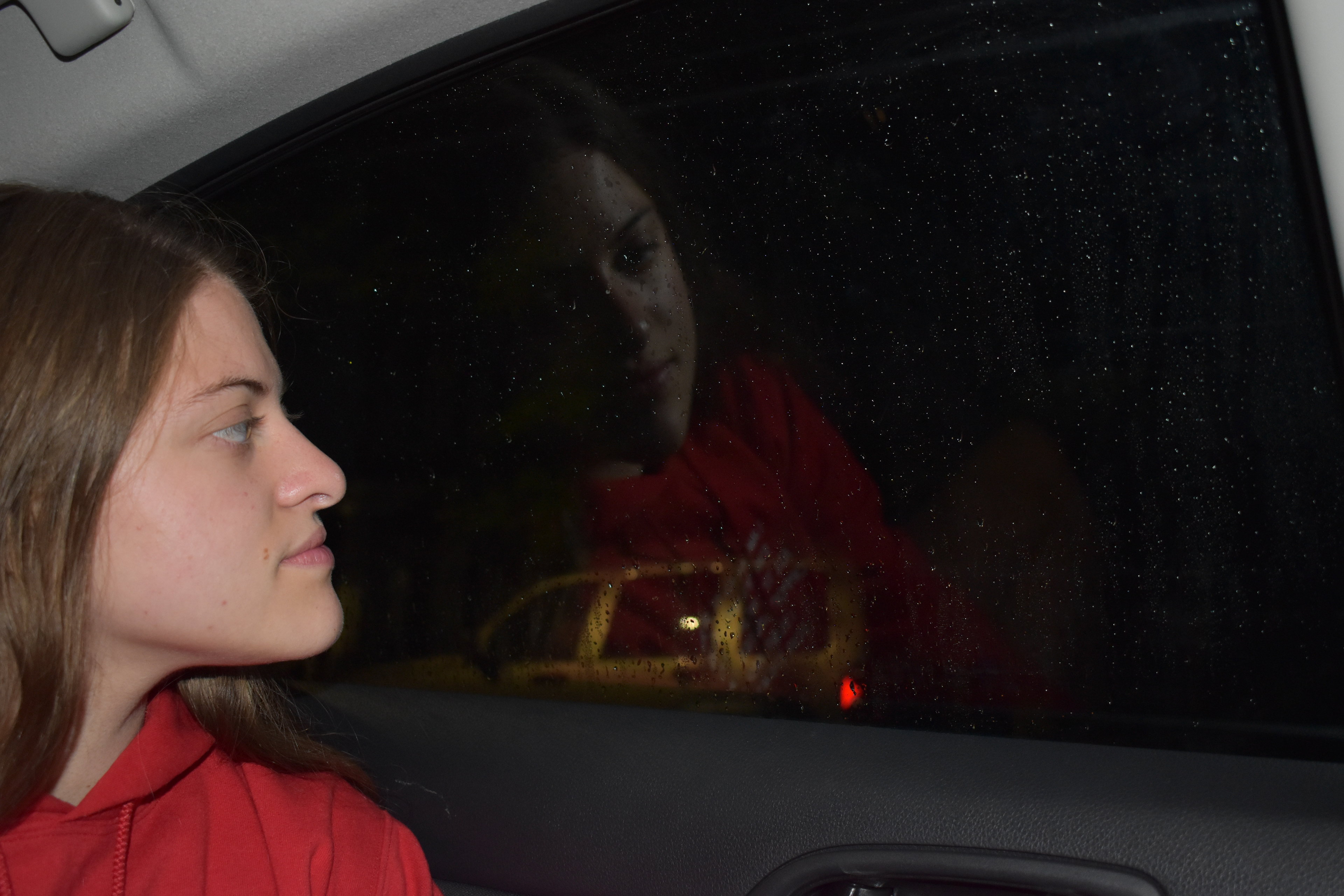
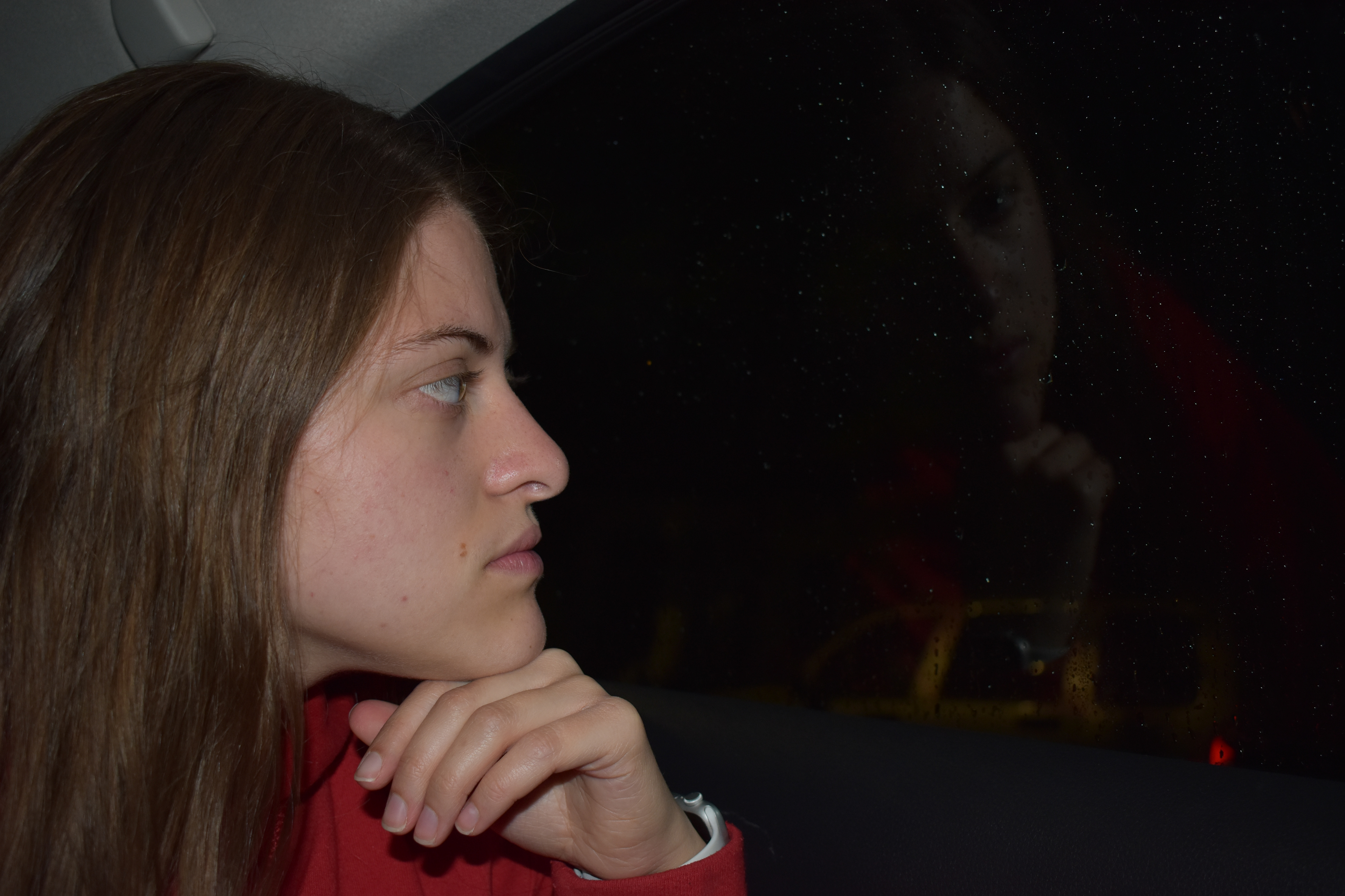
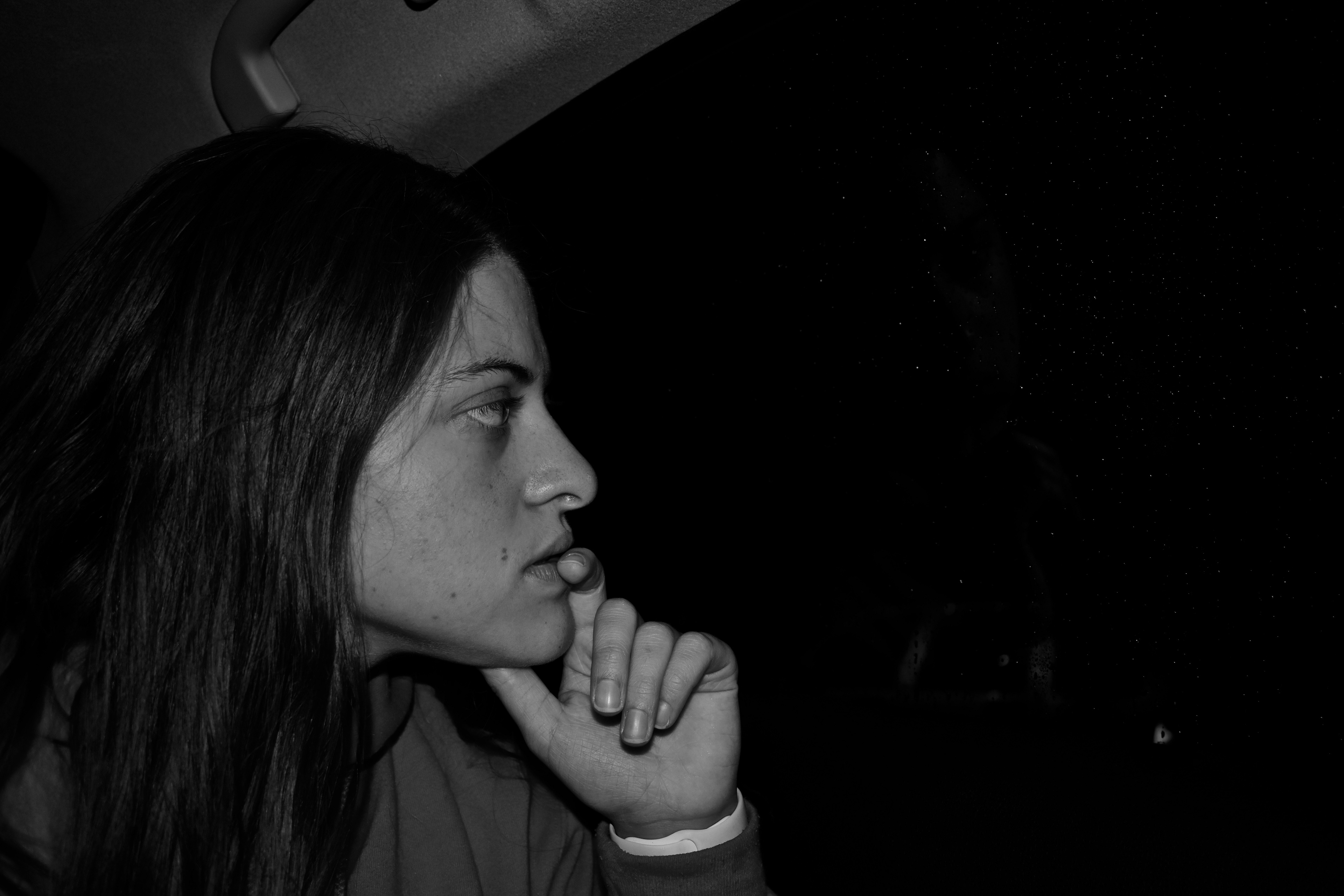
- Second round of photography -
This round was very similar to the first. I was still playing with the idea of reflections but I wanted to alter it slightly. I took a random picture to test my camera settings and I saw a cool reflection out of a window, so I took that idea and ran with it.
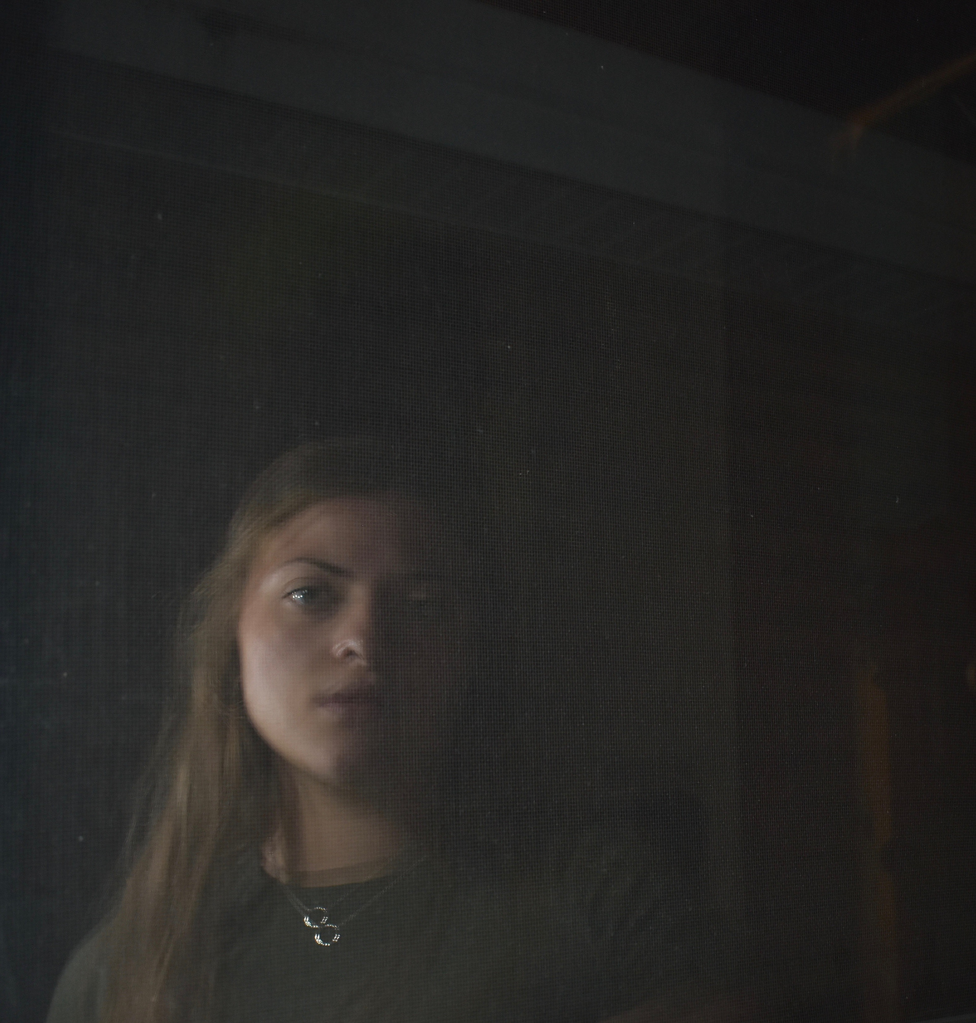
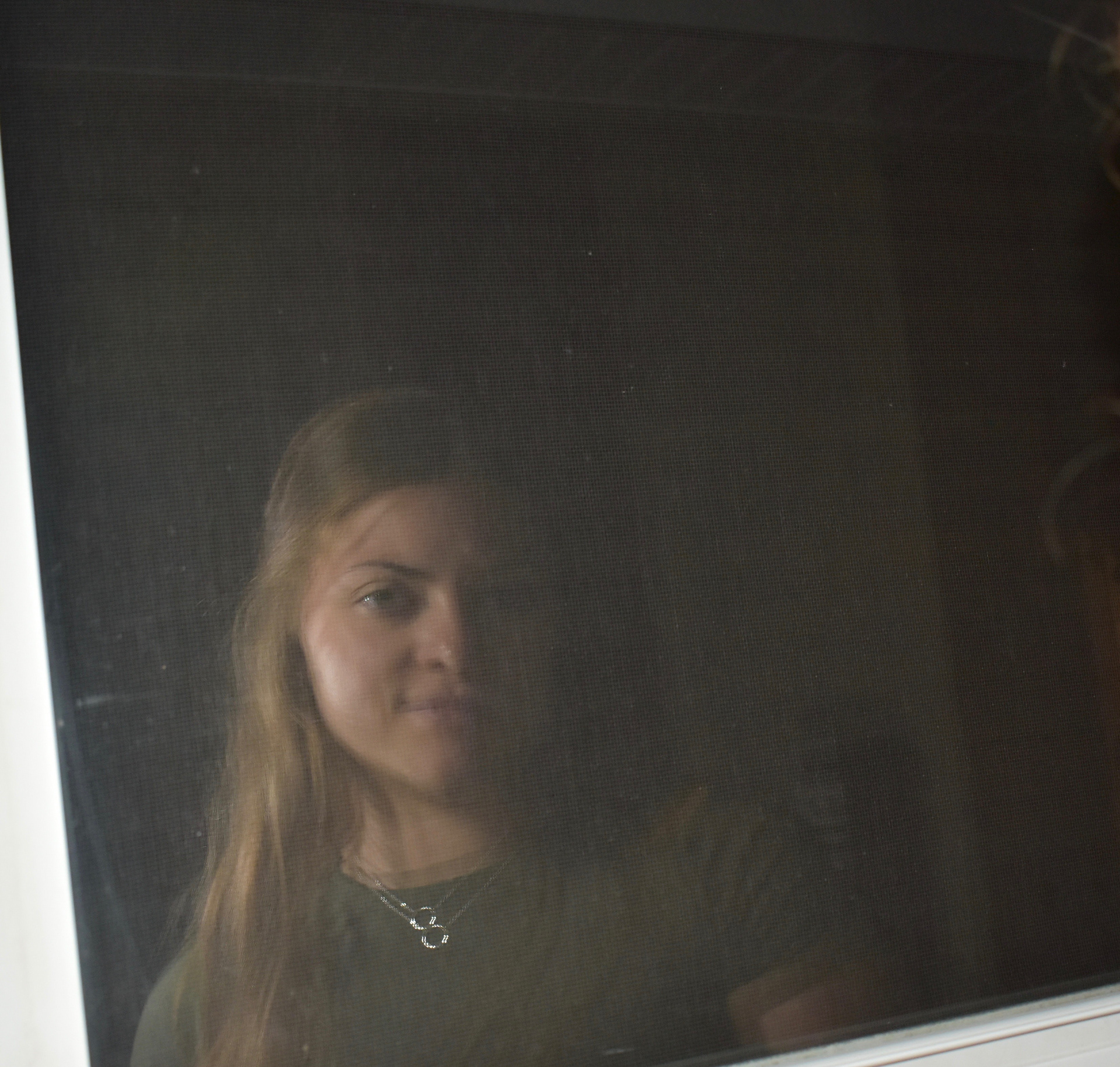
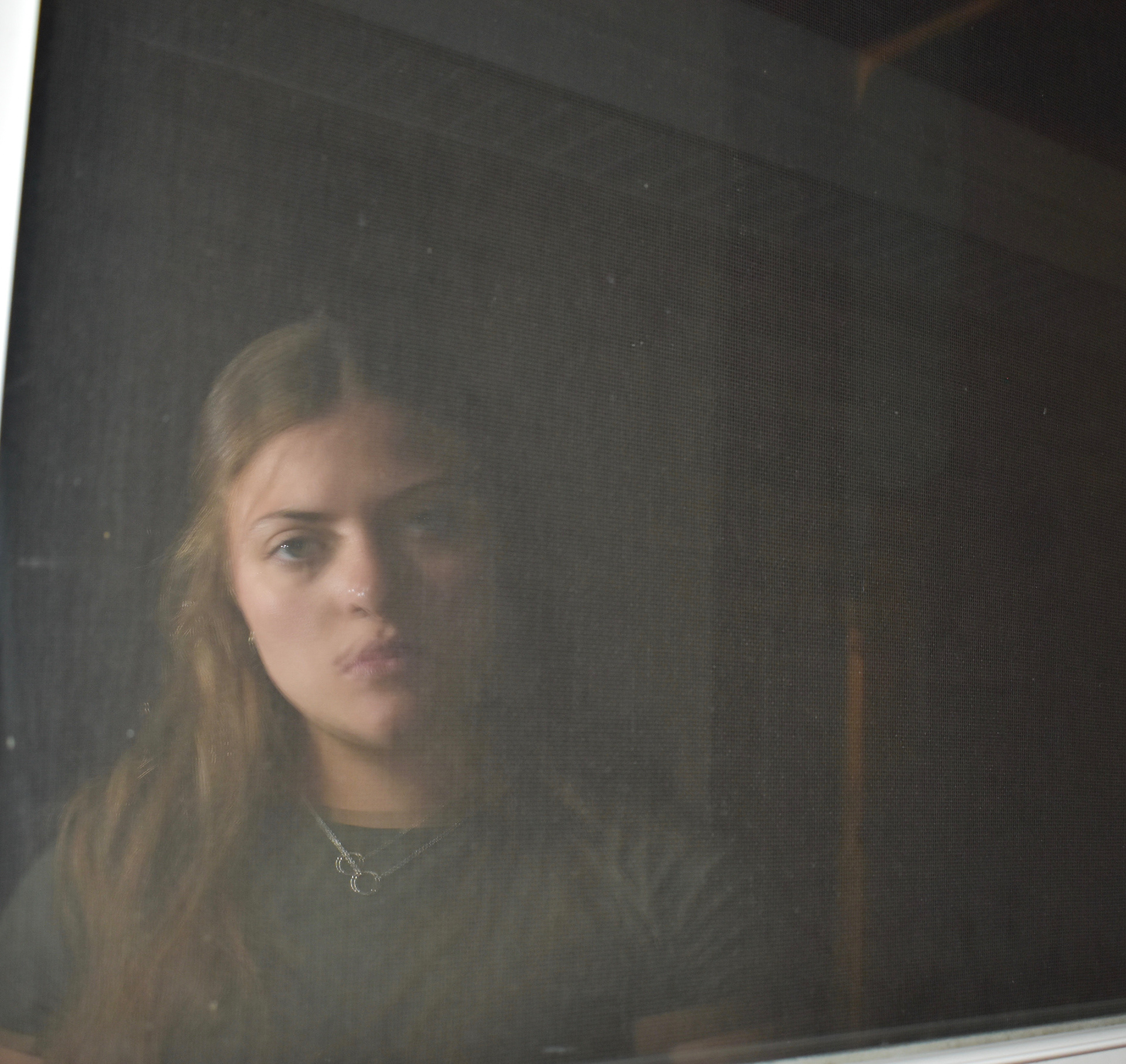
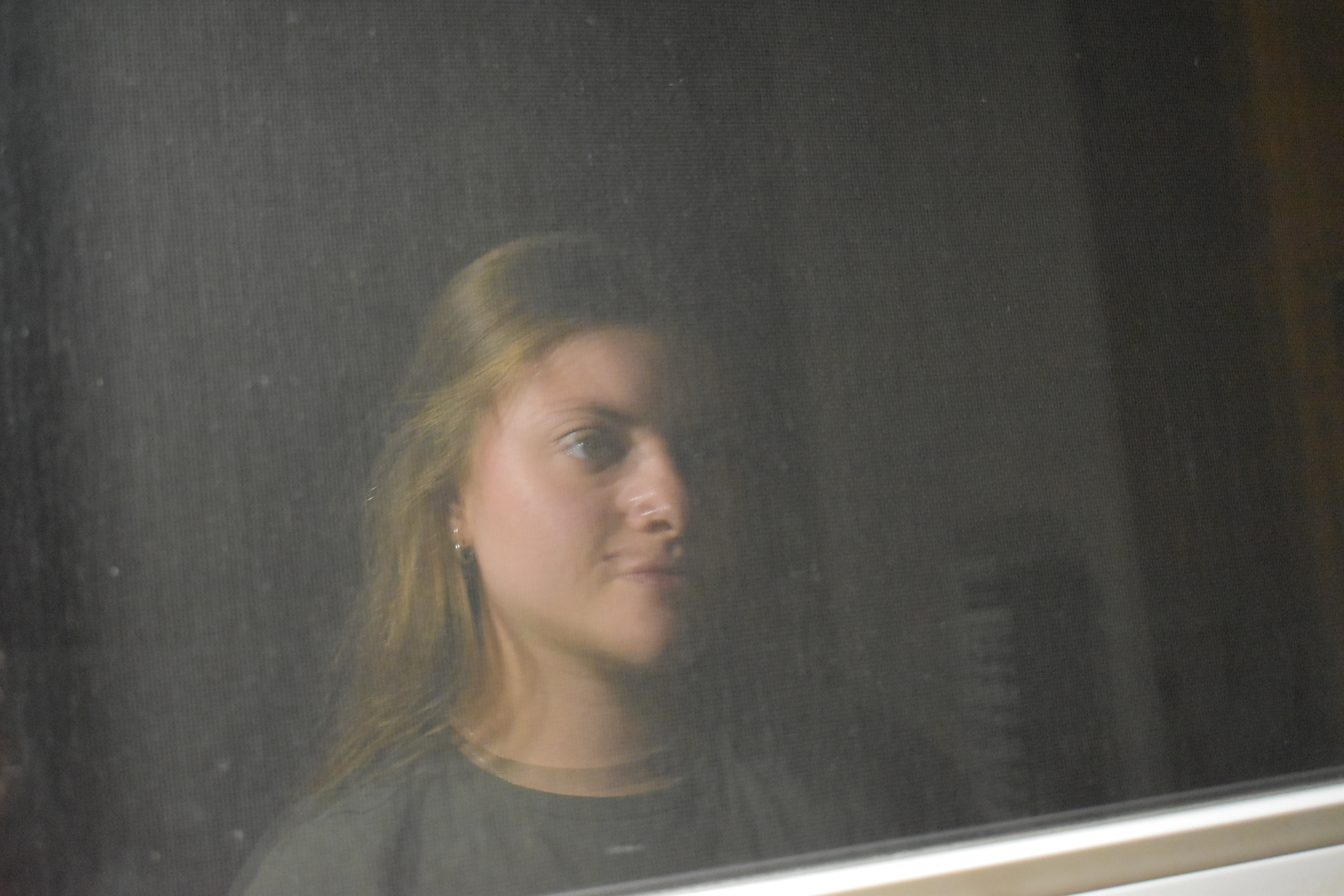
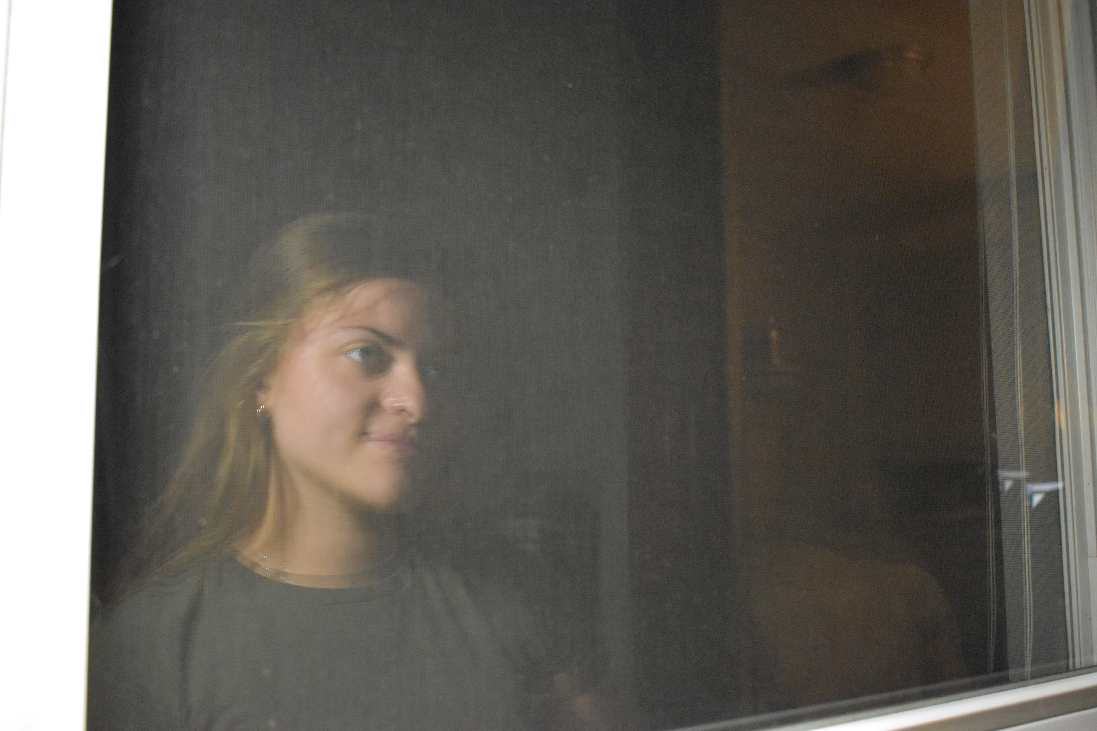
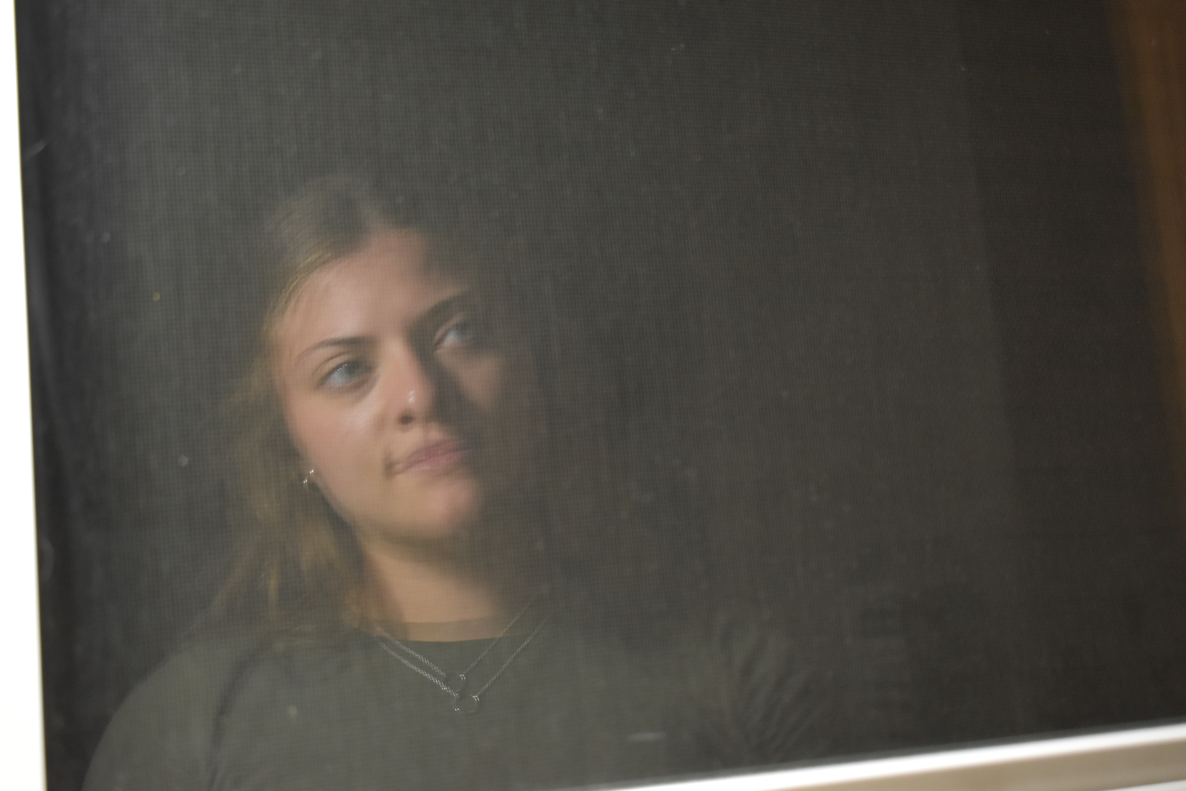
At this point, I was really enjoying the results of this round of photography. I thought there was so much potential to be had on the computer end of this project, so I started editing and mixing up these photos like I had originally planned.
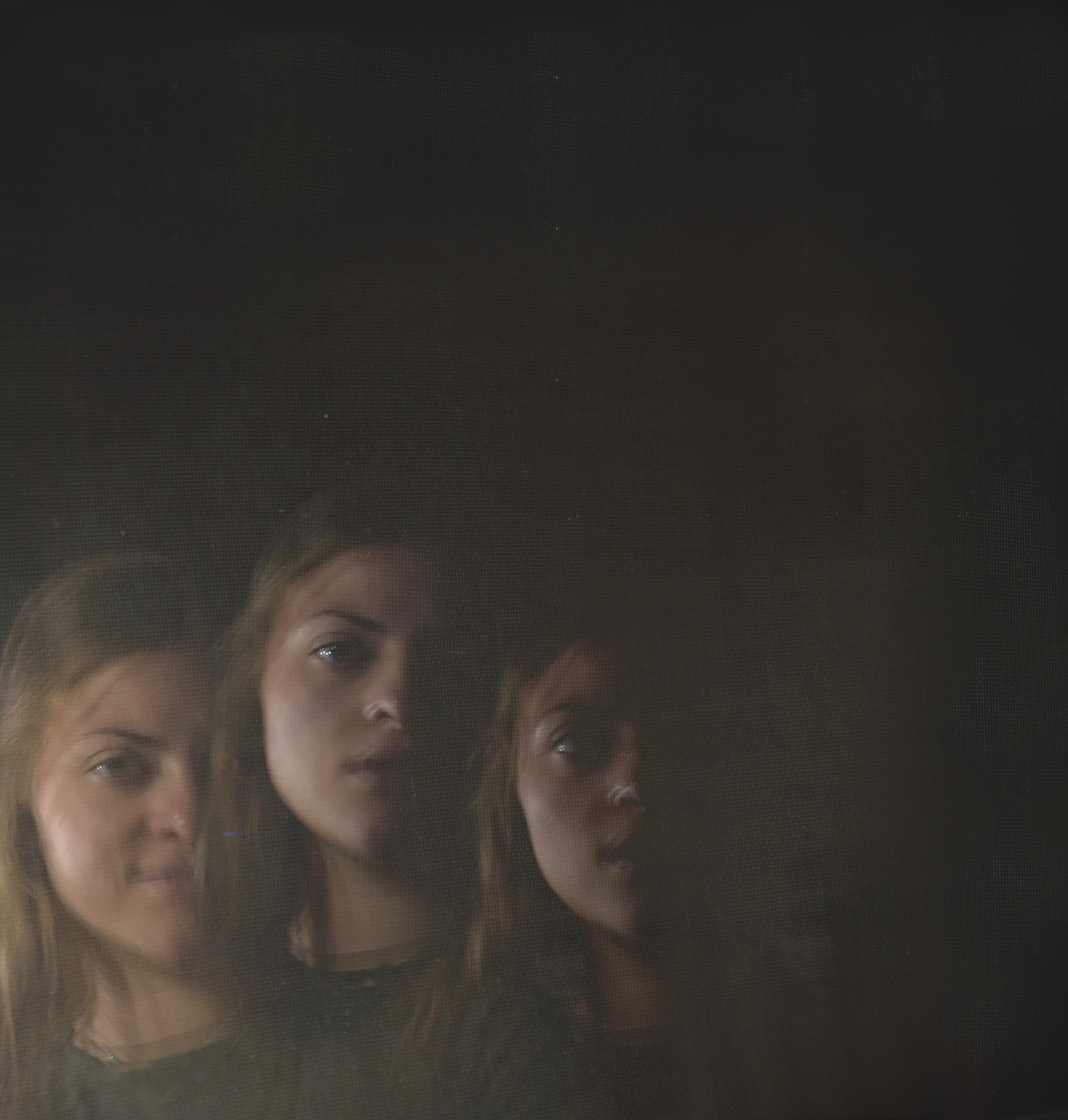
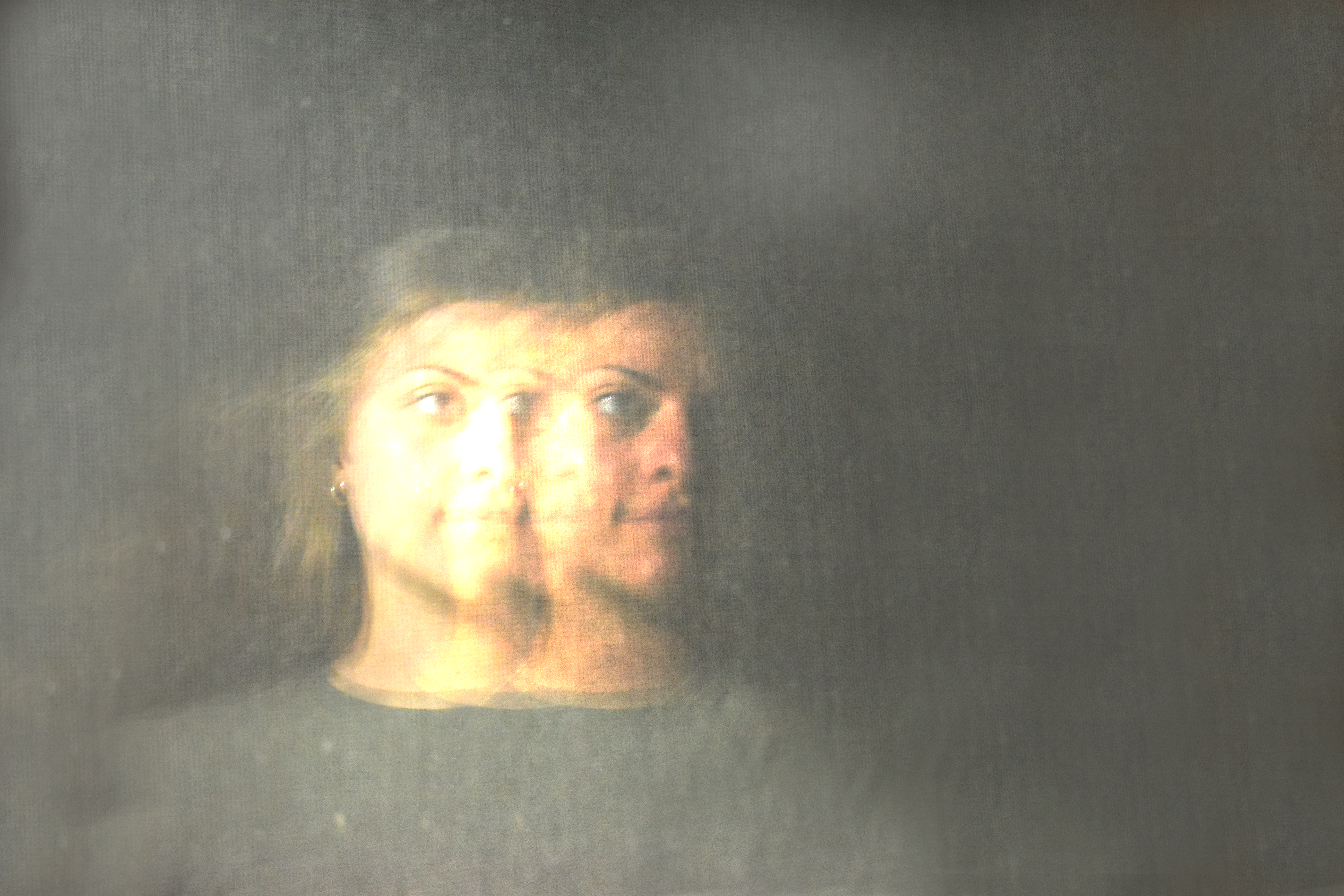
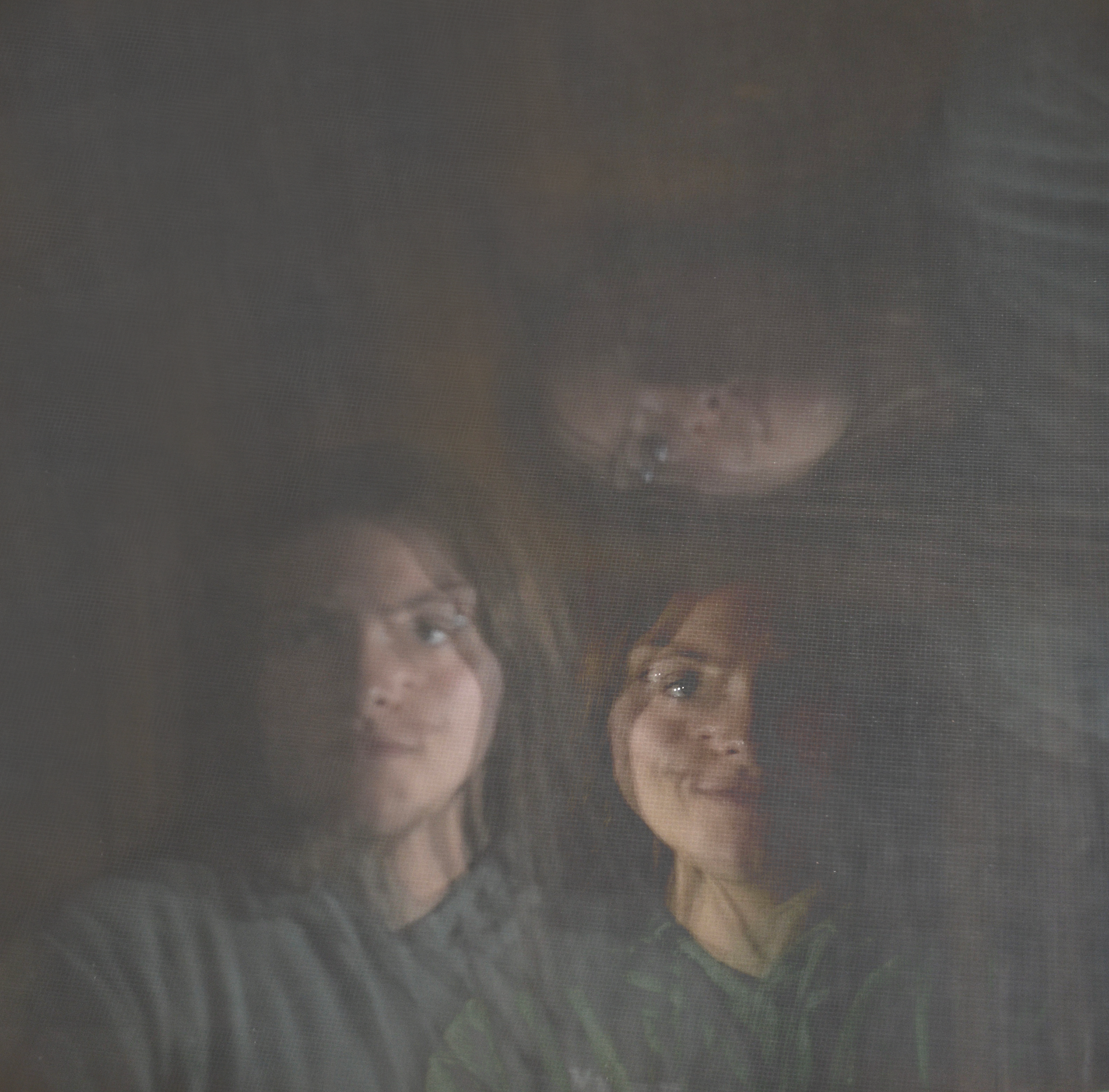
As I completed the photoshop from the second round of photography, I liked what was going on, but thought that some areas of the album were not being highlighted enough. Things such as feelings of pain and suffering, relationship issues, and mental health. So after this round, it actually helped me find my path to what I truly wanted to express out of this project.
- Final round of photography -
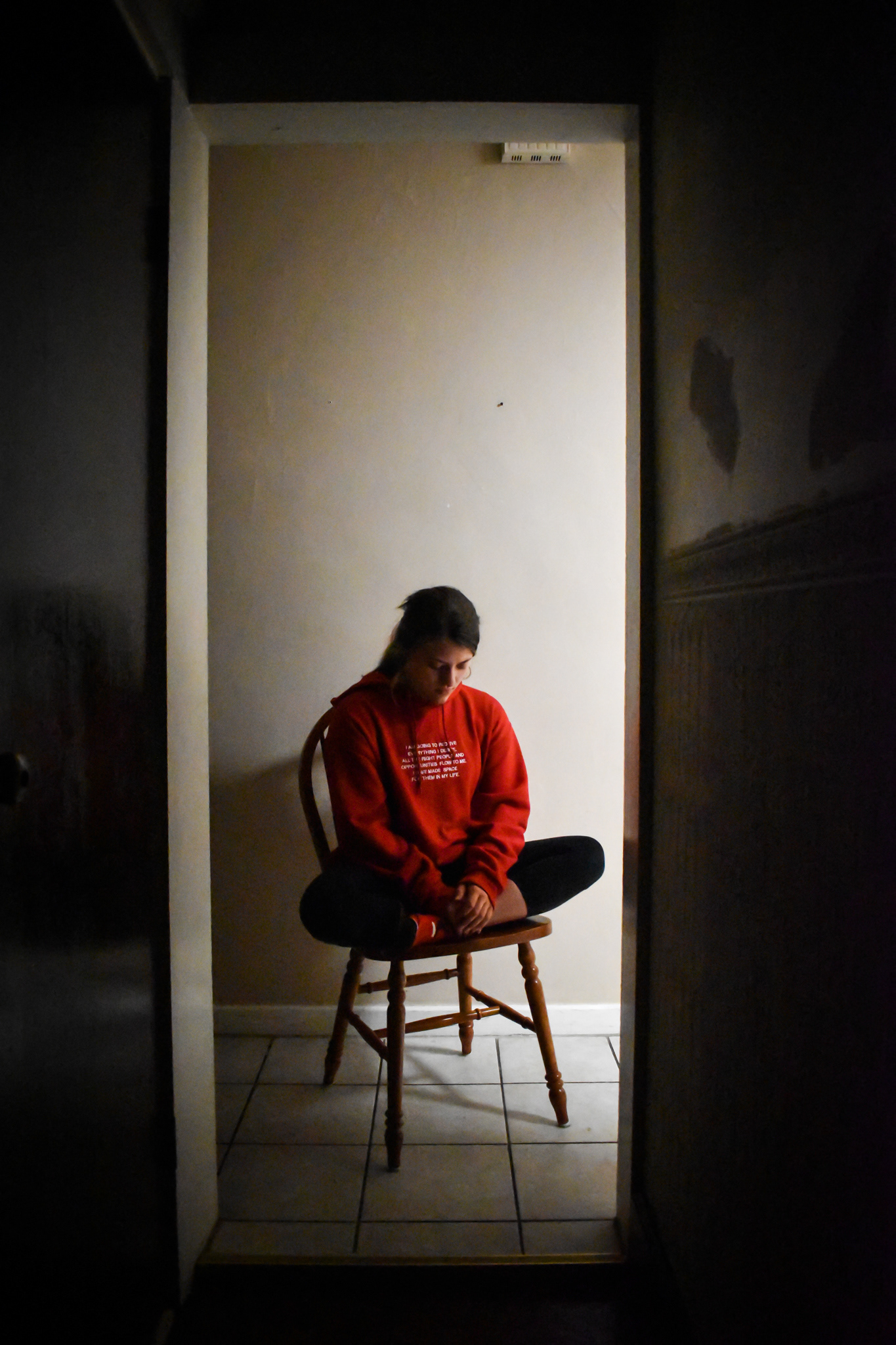
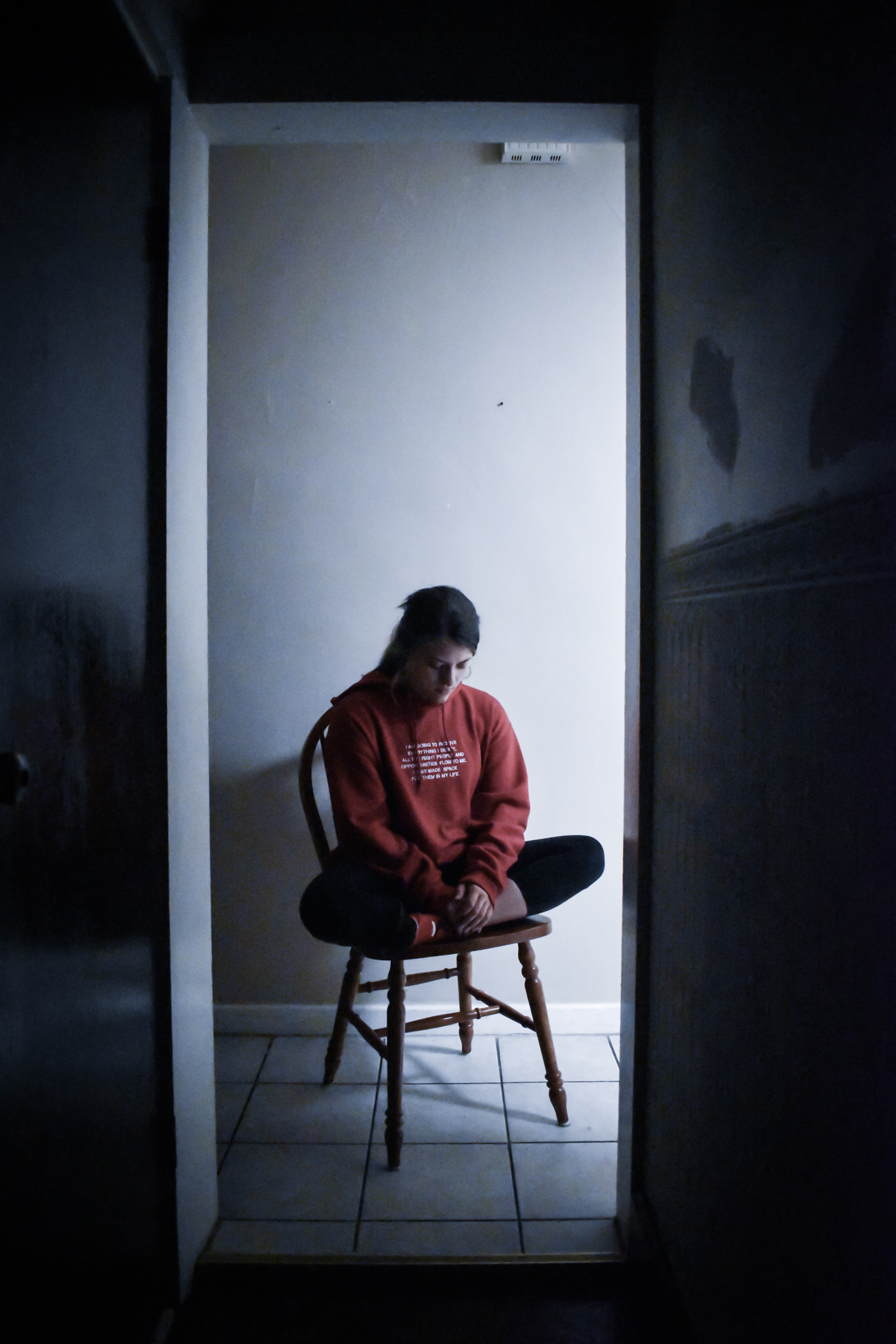
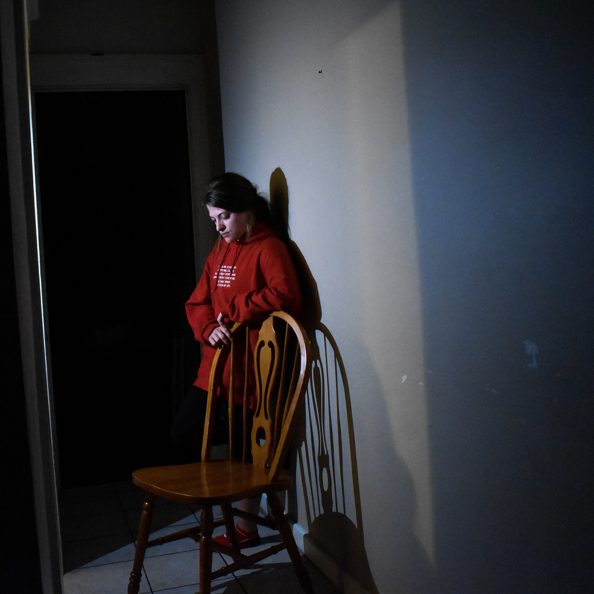
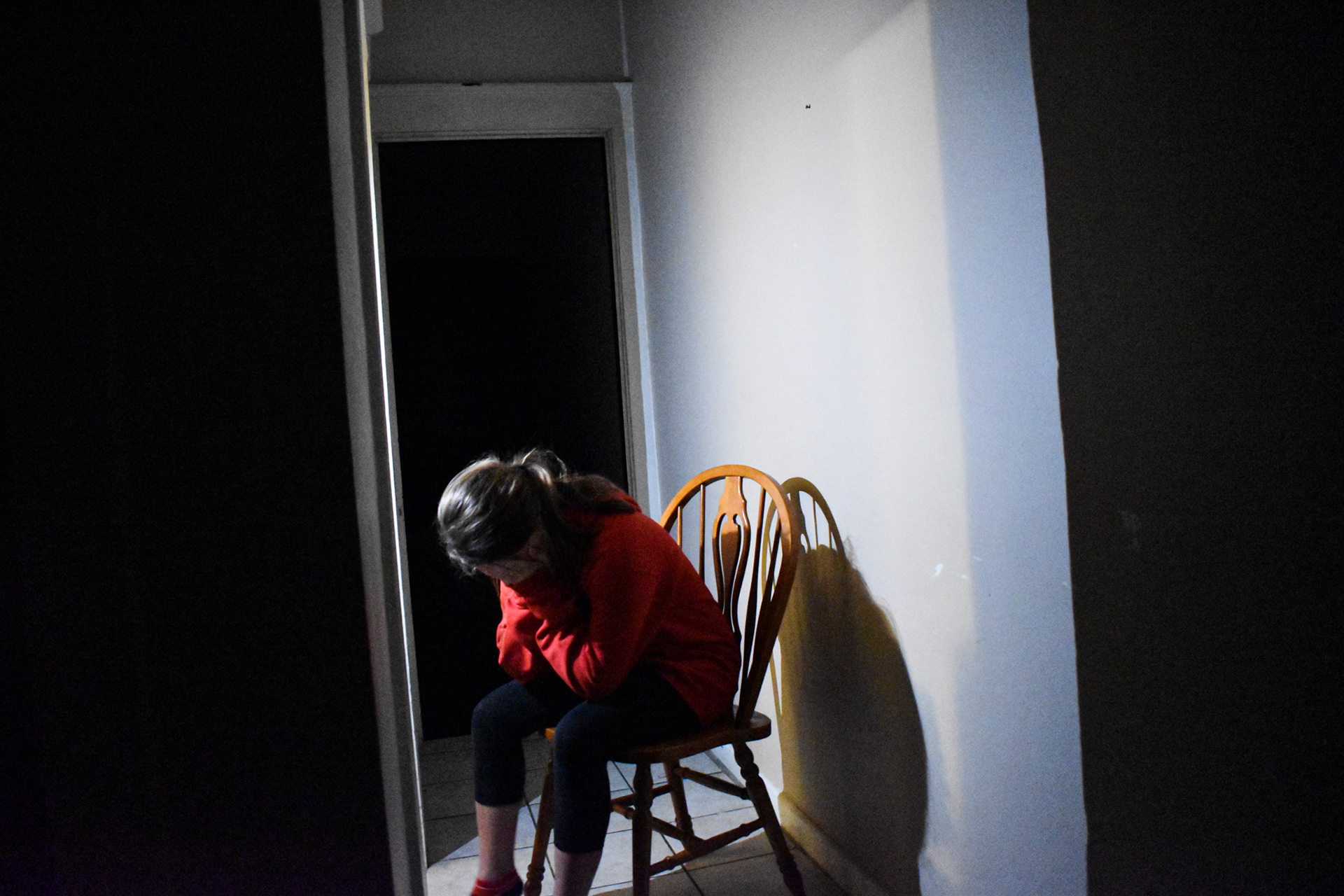
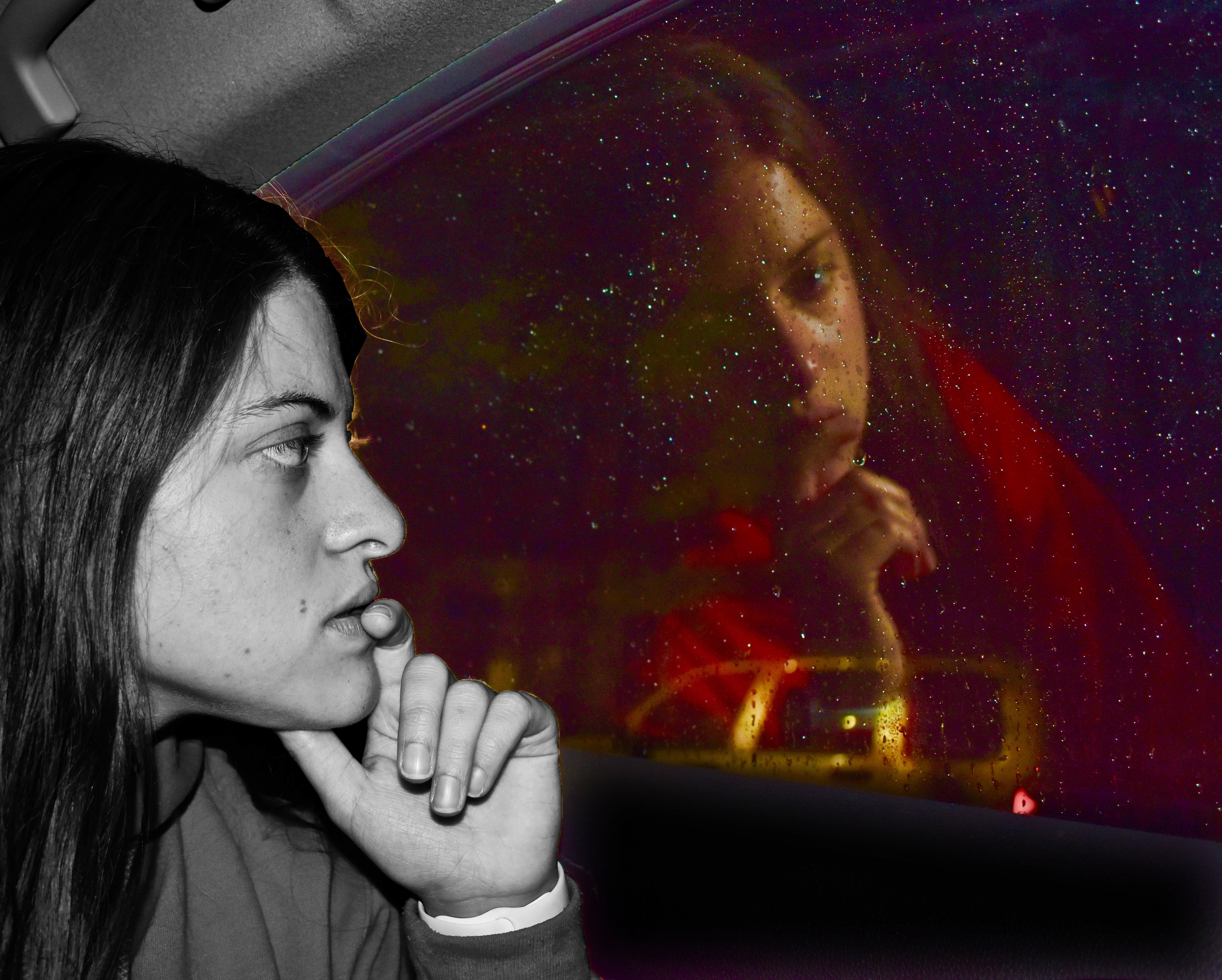
This final round gave me a good avenue to complete this project and express the values of this album. I felt that this photography left you guessing about the emotions of the subject, while also being creative in the blending of the photography to display that reflective idea from the beginning. I began with cleaning up the background and then overlaying the images. I liked the idea of centered sans serif text so I went with all caps of my favorite typeface: Forma DJR display.
- Final Photography and Mock-ups -